North-facing room colours
The renovating.co.uk team · Prices checked 25 Sep 2026
In a north-facing room, choose colours with a warm base (yellow, pink, red or brown). In a south-facing one you can go cooler, because the light is already warm. The same tin of paint on the same wall looks noticeably different in each, and the quickest way to see it is to look at one room under both.
 north-facingsouth-facing
‹›
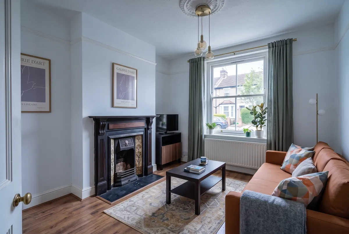
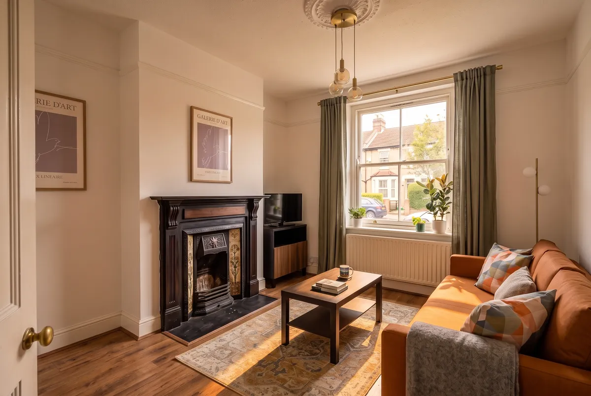
Here's a living room we designed with real IKEA and B&Q products, shown under both kinds of light.
What does the same paint look like in a north-facing and a south-facing room?
The walls in this room are Dulux Easycare Washable & Tough White cotton, a matt wall and ceiling emulsion from B&Q at £32 for 2.5L. The rest is a burnt-orange IKEA FRIHETEN three-seat sofa-bed (£649), a JÄRNVÄG rug in 160 x 230cm (£99), a HOLMERUD coffee table (£59), grey-green DYTÅG curtains (£69) and a brass GoodHome Lybia pendant (£92). The room came to £1,263 for 12 products.
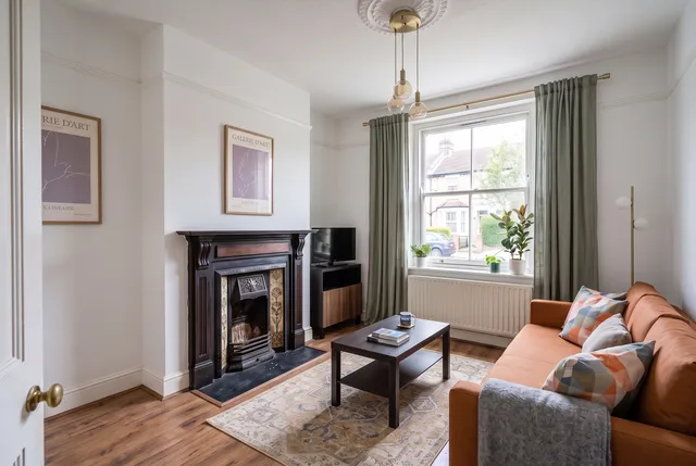
The first picture shows it as a north-facing room on an overcast day. Nothing in it has changed except the light.
The walls go a pale, cool blue-grey and the corners fall into soft shade. The orange sofa still looks warm but flatter, and the room feels colder than the paint on the tin would suggest.
The second shows it as a south-facing room in the afternoon.
The same walls are now a creamy off-white, with sunlight landing on the floor and rug and the sofa glowing. The light, not the paint, is making the difference.
One caveat on the pictures: the lighting is a fair guide to the direction of the effect, not an exact match for your room.
Why do north-facing rooms look colder?
They get little direct sun, so most of the light is the cooler, bluer light from the sky. A colour consultant quoted by Lick says that light tends to draw out a paint's cooler tones and cast soft shadows. B&Q and Dulux both say to go warm: B&Q looks for red, pink or yellow undertones and says to avoid green, grey or blue ones, and Dulux suggests pink, gold and yellow tones for a cosy feel.
What colour should you paint a north-facing room?
A warm base, in a light, mid or dark tone. Three routes come up again and again:
- Warm light neutrals. Lick suggests creamy, yellow-based whites and biscuity beiges to lighten the room, and warns that a grey-based white looks especially cool there.
- Rich, deep colours. Lick also suggests going darker for a wrap-around feel, and B&Q suggests deep, saturated blues that work with the cool light rather than against it.
- Terracotta, brick and soft pinks. B&Q says reds and oranges warm a north-facing room, and Dulux names Blush Pink as an example.
There's one point on which the sources split. No Space Like Home says brilliant white is the obvious way to brighten a north-facing room but can have the opposite effect, because with no light and shade to bring it to life it goes flat. Our north-facing picture shows that: a pale wall in cool light looks dull rather than bright. We'd choose a warm cream over a bright white in a room like that.
What about a north-facing bedroom?
The same rule applies, and you've got more freedom to go dark. A bedroom is mostly used in the evening and lit by lamps, so how the wall looks in a grey daytime light matters less than how it looks at 9pm. We'd still keep the base warm, since a cool-based colour will still look cold in the daytime light.
If you want a ready-made option, the Dulux Easycare range at B&Q includes a Blush pink in a soft sheen for £32 per 2.5L, the same price as a white.
What colour should you paint a south-facing room?
You've got the widest choice, and two reasonable directions. Dulux says cool shades such as blue, green and violet balance the intensity of the sun. Paper Room Interiors agrees, adding that cooler undertones help to cool the room down in summer. Livingetc says you can go the other way and lean into the warmth with bold colours, as long as you watch the very pale ones.
The Little Greene colour expert quoted by Livingetc says south-facing rooms have high contrast and can give very light colours a sun-bleached look, and Paper Room Interiors says paler colours can look washed out at midday. In our south-facing picture the white looks fine in the afternoon, but we'd test any pale colour at noon as well.
Paper Room Interiors also suggests dark colours can work in smaller south-facing rooms you mostly use in the evening, though not in a big open-plan space. If your room has large areas of glass, it cautions against very saturated warm colours, such as strong reds and pinks, because they can feel overwhelming.
What did it cost, and what would the alternative have cost?
Changing colour costs nothing extra in this range. The white cotton in the room is £32 for 2.5L, and so are the other Dulux Easycare colours at B&Q that we checked, including Egyptian cotton, Natural calico, Magnolia and Almond white as places to start for a warm light room, and Coastal grey and Frosted steel for a cooler one. Judge the undertone from the swatch, not the name. The 5L tin of white cotton is £46.
The expensive mistake is the wrong colour on the wall, and the cheapest protection is a sample pot and a big sheet of paper, which is what the check below uses.
How do you check which way your room faces and test a colour?
- Stand at the window with a compass app on your phone, and note which way you're facing. That's the direction the room faces.
- Paint a sample on an A3 or larger sheet of lining paper or card, as No Space Like Home suggests, rather than a small patch on the wall.
- Tape it to the wall that faces the window and the wall beside it, and look at it in the morning, at noon and in the evening with the lights on.
- Choose the time of day you're in the room most, and judge it then. Paper Room Interiors says to decide on the light you'll actually use the room in.
East and west rooms sit in between, and Dulux suggests picking by when you use the room: cooler tones for mornings and evenings in those. Check the sample at both ends of the day.
FAQ
What colours are best for a north-facing room?
Warm ones: creamy whites, biscuity beiges, soft pinks, terracotta and warm greens. Or go deep and rich if you'd rather embrace the dim light than fight it.
What colours to avoid in a north-facing room?
Grey-based whites and blue-grey colours, which look especially cool and flat in that light. B&Q also says to avoid green, grey or blue undertones.
What colours work in a south-facing room?
Most of them. Cooler blues, greens and violets balance the warm light, and very pale colours need testing at midday so they don't look washed out.
Does the same paint colour look different in different rooms?
Yes. In our living room, the same white paint came out a cool blue-grey under north-facing light and creamy under south-facing light.
- Lick: best neutral paint colours for a dark, north-facing room
- B&Q: the best paint colours for north facing rooms
- Dulux: the best shades for north, south, east or west facing rooms
- No Space Like Home: the best paint colours for a north facing room
- Paper Room Interiors: paint colours for south facing rooms
- Livingetc: colours for south-facing living rooms